The following line graph shows the yearly sales figures for a manufacturing company.
(a) What were the sales in
(i) 2002
(ii) 2006?
(b) What were the sales in
(i) 2003
(ii) 2005?
( c) Compute the difference between the sales in 2002 and 2006.
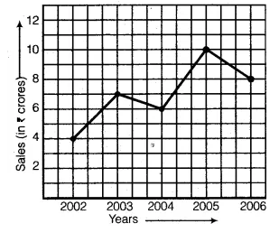
(d) In which year was there the greatest difference between the sales as compared to its previous year?
In the graph, we find that the years are represented on the x-axis and the sales (in ₹ crores) on the y-axis. The sales at any time (year) can be read from the graph exactly in the same way as we read the coordinates of a point. From the graph, we observe that :
(a)
(i) The sales in the year 2002 is ₹ 4 crore.
(ii) The sales in the year 2006 is ₹ 8 crore.
(b)
(i) The sales in the year 2003 is ₹ 7 crore.
(ii) The sales in the year 2005 is ₹ 10 crore.
( c) The difference between the sales in 2002 and 2006 = ₹ 8 crore – ₹4 crore = ₹ 4 crore.
(d) The year in which there was the greatest difference between the sales as compared to its previous year is the year 2005.