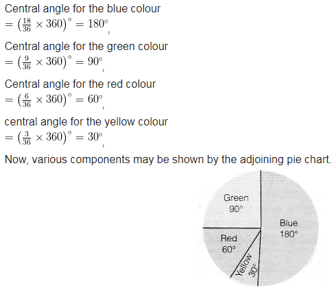
Draw a pie chart showing the following information. The table shows the colours preferred by a group of people.
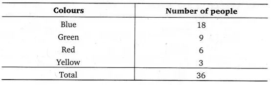
Find the proportion of each sector. For example. Blue is 18/36 = 1/2 Green is 9/36 = 1/4 and so on.
Use this to find the corresponding angles.